Movies
My Thoughts on the New Superman Costume
 By Steve Younis
Dates:
Initial Reaction: April 28, 2005
Another Look: August 22, 2005
Final Say: August 3, 2006
In this article I'm going to be examining, in detail, the new Superman costume for the up-coming movie "Superman Returns".
Initial Reaction: At this point in time we'd only seen one photo of Brandon Routh in the costume, but fan reaction was mixed, yet very vocal nonetheless. Personally I think it's good, but not great. Brandon looks fine, but I have issues with certain design aspects of the costume.
Another Look: With time having passed, and with clearer photos and actual film footage having been released, my perspective on the costume has changed somewhat.
Final Say: My final say on the costume's design having seen the movie and interviewed the Costume Designers and examined the costume up-close and in person.
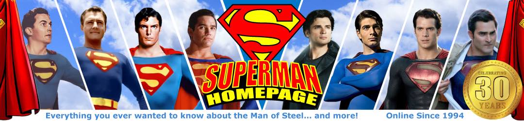
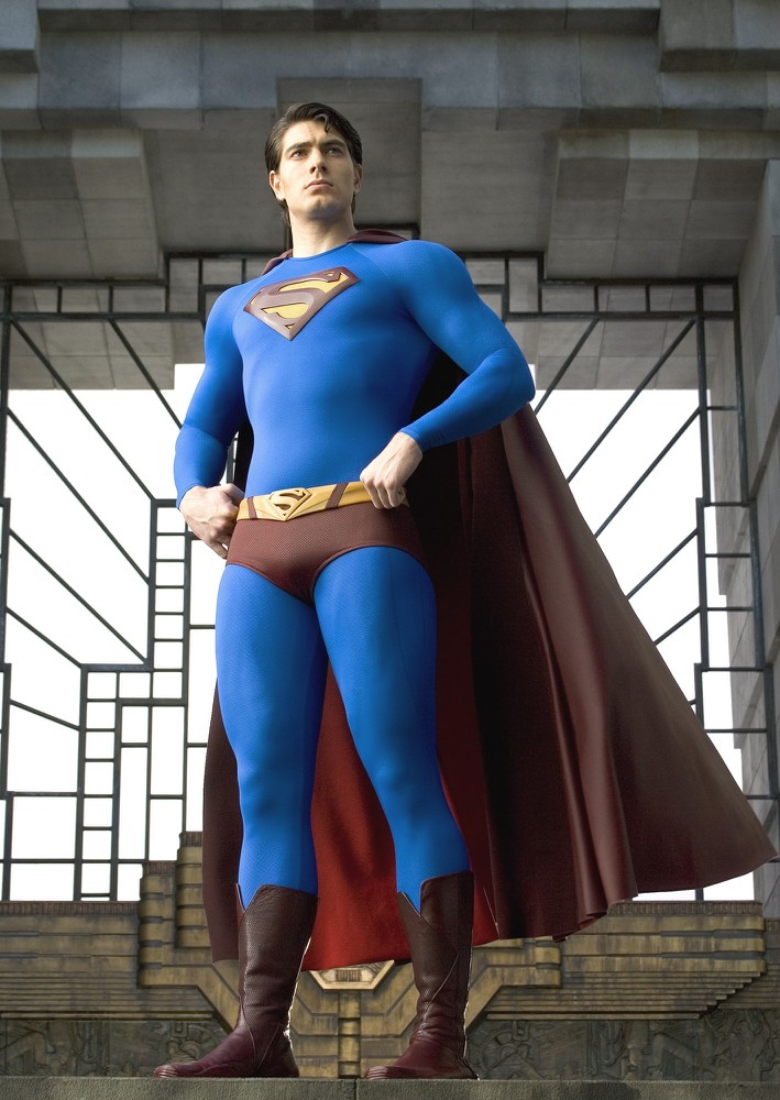
THE CAPE
 Initial Reaction
Not sure how accurate the colors are in the only photo we've seen (there's speculation that the cape and other red parts of the costume may not be 100% accurate in this photo due to background and lighting issues).
Going by what I can see, to me the red is a touch too dark in that photo, but I'm not too worried about a darker red for the costume. I don't mind it.
The length looks about right to me. I like the longer, calf-height cape rather than the behind-the-knees look.
There's much speculation on whether this cape has the yellow version of the "S" emblem on the back... I'm not too fussed either way. I'd prefer to see it there, but it's not essential.
My biggest problem with the cape, and in part with the whole look of the costume, is where the cape joins onto the costume. This in part is mostly due to the collar on the costume, but I'll get to that soon. My problem with the cape, is that it doesn't come over the shoulders. Without this feature the character somehow looks less imposing and lacks a certain regal quality.
The material has a leather or rubber look to it. Not sure what material it is exactly, but I don't have a problem with it at all... just as long as it has a nice motion when it comes to the flying sequences... It does look a bit heavy, but otherwise the material looks fine to me.
Another Look
Now that we've seen more photos and some footage, and having seen the costume in person on the streets of Sydney during filming, I'm happy with the darker red. The cape actually has multiple reds, with the interior (under-side) of the costume graduating from the darker red to a bright red in the middle.
We now know that there is no "S" on the cape, and again, that's not a problem for me. It's not really a big deal. It wasn't on the cape in "Superman: The Animated Series", and I'm guessing there's a similar reason it hasn't been included for this movie (i.e. issues regarding CGI animation).
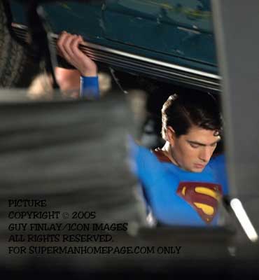
 I still think the point where the cape joins the collar isn't the best. But having seen images from different angles (see the one shown right), I'm not too concerned anymore about how the cape sits on his shoulders. It has a George Reeves feel to it this way.
Final Say
My opinion on the neckline and where the cape joins hasn't really changed. I prefer a wider neckline. But the cape itself worked fantastically in the movie. It flowed nicely, hung well and added a weight to the costume not seen in other versions.
THE BODY
 Initial Reaction
Now to the main body of the costume... the blue looks fine to me. The color is not as light or turquoise-looking as the Chris Reeve costume, but not as dark blue as the Dean Cain costume. I like it!
My biggest HUGEST problem with the costume overall is the neckline. It's impractical on a number of levels. Firstly, the high collar doesn't look right. It's this "turtle neck" collar that ruins the connection of the cape. In nearly ALL other versions of the Superman costume the collar has had a square neckline that is positioned just below the collar bones. This allows the cape to connect to the front of the neckline, and allows it to drape over the shoulders.
The high neckline is also impractical for Clark Kent. It means he must always wear his shirts with the top button done up. No open neck shirts for this mild-mannered reporter, otherwise he'll expose the blue collar of his Superman costume underneath. I've heard this high collar is to hide some kind of muscle body-suit underneath... but I don't know. Either way it looks silly, stuffs up the cape, and is impractical in my opinion. Even the George Reeves costume (which had a round neck) didn't go this high.
The material, if you look closely, appears to have a very small repeating shield pattern... It's not bad, and adds a slight lift to the blue fabric. I have no problem with this feature at all.
Another Look
 The blue looks great. It's vibrant and works well. My concerns with the collar are still there, but I'm not as put off by it as I was upon first seeing it.
When I saw Brandon in action during a public shoot in August 2005 I hardly noticed the neckline. It wasn't the eyesore I first thought it to be. I still would have preferred a more open-neck design, but I can live with this.
Final Say
Perfect! The costume's blue is 100% right on the money. As I said above, I would have prefered a wider neckline, but other than that, I had no complaints with the costume's over all look.
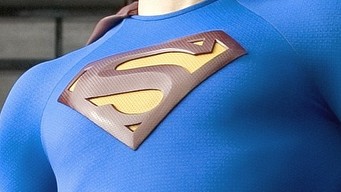
THE "S" SHIELD
 Initial Reaction
Probably the biggest point of conjecture amongst fans is the "S" shield on the chest of the costume.
I find myself sitting on the fence on this one... I don't mind the "S" being given a solid presence rather than just being part of the fabric of the costume. I've heard some people complain that it would make it harder to hide beneath the fabric of his Clark Kent clothing, but I don't know about that.
The biggest complaint seems to be that the "S" is too small. I agree, it should be bigger, but I do have a theory on that. My guess is that Bryan Singer and crew fell in love with the idea of making the "S" shield an actual chest plate, a solid object. The problem is, being made of harder material, if they made it larger (as most fans would like) then Brandon's movement would be restricted. He couldn't fold his arms across his chest or reach forward and grasp something with both hands... the larger solid chest plate wouldn't give him that flexibility. Hence the smaller "S". That's just my theory, but I think there could be some truth to it.
Another Look
Bryan Singer himself has answered questions about the size of the "S". He said, "First we made the suit. But after we cast Brandon, we started modifying things so it looked right. I went back and looked at the other suits. If the 'S' was too large or silk-screened, I must tell you it would have looked, at this point, like a billboard or something. It had to be just the right proportions for his head and chest and things like that."
This makes perfect sense to me. The proportians have to look right. While we've grown accustomed to the "S" becoming larger and larger in the comics, for practical real-life applications, the "S" can't be seen to start folding underneath the actor's armpits. And I still stand by my theory from my initial reaction regarding the solidness of the raised shield...
Final Say
There's really nothing more to be said about this... It looked fine in the movie. The size didn't look too small at all.
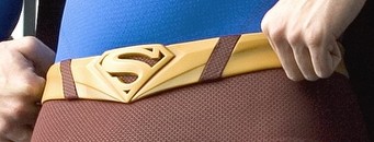
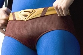
THE BELT
 Initial Reaction
I don't personally think there's a need for the "S" belt buckle. I'd much prefer the standard round oval shape buckle. But it's a fairly minor change that I think most fans can live with. The angular point design does harken back to the Supergirl style belt though. The color is nice... more golden then yellow, which is good.
Another Look
My point of view hasn't really changed on this aspect. I still think there was no need for the "S" on the belt. But as I stated in my initial reaction, it's a minor thing and something I can live with.
Final Say
I actually didn't notice the belt at all during the movie. In a still photo your eye is drawn to it, but in action it's not really noticable and hardly worth mentioning.
THE BRIEFS
 Initial Reaction
The fabric for the red briefs or shorts appears to be similar to the rest of the costume, yet different to the cape. Again, not sure if the color is actually that dark, or if it's just a trick of the lighting in this photo. They are positioned a bit too low... more like hipsters, but again, not a major concern, nothing to get too worried about.
Another Look
Again my view on this aspect hasn't really changed at all. The material of the red briefs does appear to simply be a red variety of the same material the rest of the blue parts of the costume are made from. And again, I'm not concerned with the darker red being used.
Final Say
No change of opinion here. Briefs are fine.
THE BOOTS
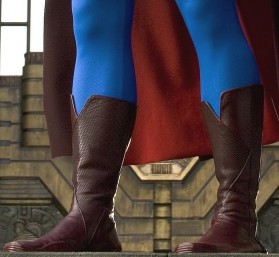 Initial Reaction
I'm not entirely won over by the boots though... I've never thought of his boots having a leather type look. I've always preferred them to be of a similar material to the rest of his costume. After all why would Superman need sturdy boots? He's invulnerable. Either way, I would have preferred them to go a bit higher up on his calves.
Also not sure about the color, whether this photo is deceptive in showing their true brightness or whether they are indeed a blood red color (similar to that of the cape).
Another Look
I'm sticking with my original reaction regarding the boots. It did occur to me that with using leather boots that they couldn't come over the calf muscles for practical reasons (if you've ever tried running in Slickers or gumboots you'll know what I mean). Again, I'm not concerned about the darker red, it looks fine to me.
Final Say
The boots did look a little dark on screen, but they didn't detract from the movie in any way.
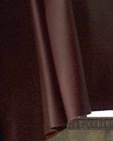
BRANDON ROUTH
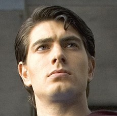 Initial Reaction
Now for the man wearing the costume...
The hair and face look fine... The body is fairly muscular, but obviously not as buff as what we've come to expect from Superman when in comparison to what we see in the comics. He appears to be as muscular as Christopher Reeve was. But again, it's hard to tell from just one photo.
I have heard a few fans complain about his hair, but I did hear from one of the crew working on the movie that his hair length and style was actually something touched on in the story line of the movie... So it's a look they've purposely gone with for a reason. I guess we'll just have to wait and see how they work this in. Personally I don't have a problem with his hairstyle at all.
Another Look
Brandon looks better each time I see more photos and video footage of him, both as Clark and as Superman.
I've heard complaints that the spit-curl on his forehead is the wrong way around. Well at least he has one! George Reeves and Dean Cain didn't.
Final Say
We have a new Superman! Brandon's potrayal of Superman was spot on. I totally believed in him. His voice, his manner, the way he walked, flew and spoke.
IN CONCLUSION
Having said all that however, the costume is not the be-all and end-all of "Superman Returns". I found it very disappointing when I read comments from so-called fans saying they'd be boycott the movie if the costume wasn't changed. That's ridiculous!! The movie is still VERY much worth watching, whatever you think of the costume.Steve Younis