Mild Mannered Reviews - Regular Superman Comics
Detective Comics #756
Scheduled to arrive in stores: March 21, 2001Cover date: May 2001
Writer: Greg Rucka
Penciller: Coy Turnbull
Inker: Dan Davis
Part 2 of "Lord of the Ring" (Continued from Superman #168)
Reviewed by: Jason Czernich (jczernich@hotmail.com)
In part two of this crossover with the Superman monthly, Superman confronts Batman and Lois Lane as they plan to steal the infamous Kryptonite ring from under President Luthor's nose. Superman spends more time confronting Lois and as a result Batman slips away and leads Superman on a merry chase/scuffle through the halls of the White House with Lois following close behind. Along the way, Sasha Bordeaux, Bruce Wayne's bodyguard, gets involved in all the action. Superman even calls her by name at one point making her wonder more about her employer's secret life...
The chase ends in the Oval Office where Batman finds the Kryptonite ring and switches it for a fake. Of course President Luthor arrives and orders Superman to search Lois and Batman for the real ring. Just to be sure he has the genuine article Luthor's tries both rings out on Superman and keeps the one that appears to make Superman swoon. Luthor let's Lois and Batman go with the fake ring as a souvenir of their failure. Later, on the streets of Washington D.C. we find that Superman was faking illness and that he and Batman staged the fight to fool Luthor into thinking they were on opposite sides. They actually have the real Kryptonite ring back in their possession because Superman faked his reactions when Luthor tried both rings on him. The last page of the story shows Sasha in Bruce Wayne's hotel room, searching through his luggage and finding Batarangs and a few other Batman gadgets.
 Story - 3: Greg Rucka can keep it simple and his fellow professionals in the field know this. Rucka can write a good crime yarn or political thriller and have it so the reader feels that they know what's going on. The really magnificent part to all this is he does it without spoon feeding the reader. We can see Sasha Bordeaux getting suspicious thoughout the story through hints and ellipses in her dialogue, like on page ten. It's never stated in a gratuitous voice balloon, "Y'know, I think Mr. Wayne is Batman!" We are pointed to that conclusion, not force fed it.
Mr. Rucka is a scripter that can give us Whiteout as well as good mainstream comic tales. Interest is maintained in a Rucka story that never lets up, not even when you state, "More good stories please." If the well of Rucka stories has a bottom, then I haven't laid eyes on it yet. This man actually tries. He never opts to end a story the easy way. He'll slip in something to whet your appetite for another day. The Sasha subplot was a fine example of this even though it is a double edge. For regular Detective Comics readers it is a culminating treat but it may make regular Superman readers, who may not pick up Detective Comics on a regular basis, scratching their heads at who Sasha is and why exactly her discovery of Batman's alter ego is more significant than if some regular schmuck finds out the secret.
Finder, Keeper, Smoker, Shooting at Midnight are critically acclaimed works by Rucka that you won't find on the comic racks. Try the mystery section of your local bookseller and you'll have better luck. Why bring this up? It's outside work like those novels that give Rucka an edge over most other writers in the mainstream arena of sequential art writing. While there are a lot of writers out there in the medium of comics that can only script superheroes and not much else, there are people like Greg Rucka, Jeph Loeb, Grant Morrison, Alan Moore, Frank Miller and others who have outside comics experience that they bring into their comics work.
 Art - 4: Coy Turnbull and Dan Davis don't waste our time here. Turnbull does his own semi-expressive style on touches like capes and costumes in this issue. The pencils aren't afraid to zoom in, zoom out, or make a combination of the two on the same page layout.
He'll exaggerate and make Luthor sneer like a devil on page eighteen, panel two, but he'll be more subtle with the facial expressions that come across Sasha Bordeaux's face all throughout the story as she's perplexed by the ever growing mystery of her employer and his alter ego. Turnbull wasn't able to get down the more freakish types in Justice League of Arkham and make them stick to the wall but here he's more becoming. He can handle everyday people and their assorted looks.
The coloring compliments Turnbull's art stylings. The filtered colors don't take away but instead add to this art job, giving the story more of a heavy feel. That's perfectly appropriate for a story where a White House break in occurs in order to regain the one artifact in DC's fictional world that can kill it's most powerful hero. It was also fitting to see emphasis on the Kryptonite ring, the main object of the story, by having the ring case, the jewel itself, and the gleam of it colored green. It does break the color filter system of Detective Comics but it is a sure exception to the rule. The texturing was not overdone to the point of distracting. The Oval Office carpet when shadows fall upon it, Lois' hair, and the way clothes wrinkled were textured to the apt degree. Like the regular penciler on Detective, Shawn Martinbrough, Turnbull and Davis appear to work better in a limited color palette than on a fully colored story and this fill in on Detective Comics conveys that. Maybe they can do more fill ins for this title in the future or even a contribution to the Batman: Black & White back up feature over in Batman: Gotham Knights.
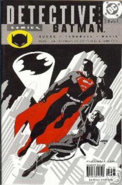
Cover Art - 4: Kryptos Superman gets the noir treatment on this month's cover of Detective and Dave Johnson makes him fit right in. Superman is drawn with a good use of shadows to make him blend right into the cover of the Dark Knight's hippest title.
The range of grey tones make up for the absence of yellow and blue from the Man of Steel's costume. The red just attracts your eyes to Superman because, simply put, color draws the eye. This is something Frank Miller is very well aware of in such Sin City works of his as, The Babe Wore Red or That Yellow Bastard. Color is used for effect on this cover much like in Miller's Sin City. The use of red and the central positioning of Superman's figure on the cover gives Superman attention and emphasis.
A Superman cover that has a Bat-Signal but no Batman on the cover does make one curious as to what's going on inside. Hopefully that curious someone will pick up this gem and visually consume those insides. It's a fine read.
Other recent reviews:
Mild Mannered Reviews
2001
Note: Month dates are from the issue covers, not the actual date when the comic was on sale.January 2001
- [1] Superman #164
- [2] Lex 2000
- [3] Adventures of Superman #586
- [4] Superman: The Man of Steel #108
- [5] Action Comics #773
- JLA #49
- JLA/Witchblade
- JLA: A League of One
- JLA: Act of God #1
- [6] Superman #165
- [7] Adventures of Superman #587
- [8] Superman: The Man of Steel #109
- [9] Action Comics #774
- JLA #50
- JLA: Seven Caskets
- JLA versus Predator
- Justice Leagues: JL? #1
- JLA: Act of God #2
- [10] Superman #166
- [11] Adventures of Superman #588
- [12] Superman: The Man of Steel #110
- [13] Action Comics #775
- President Luthor: Secret Files and Origins #1
- JLA: Act of God #3
- Justice Leagues: Justice League of Aliens #1
- Justice Leagues: JLA #1
- [14] Superman #167
- [15] Adventures of Superman #589
- [16] Superman: The Man of Steel #111
- [17] Action Comics #776
- JLA #51
- Legends of the DC Universe #39
- Superboy's Legion #1
- [18] Superman #168
- [19] Adventures of Superman #590
- [20] Superman: The Man of Steel #112
- [21] Action Comics #777
- Superman Adventures #55
- JLA #52
- Superboy's Legion #2
- JLA: Black Baptism #1
- Batman: Gotham Adventures #36
- [22] Superman #169
- [23] Adventures of Superman #591
- [24] Superman: The Man of Steel #113
- [25] Action Comics #778
- Superman Adventures #56
- JLA #53
- [26] Superman #170
- [27] Adventures of Superman #592
- [28] Superman: The Man of Steel #114
- [29] Action Comics #779
- Superman Adventures #57
- JLA #54
- JLA: Incarnations #1
- Super Friends! Trade Paperback
- Superman: Where Is Thy Sting?
- [30] Superman #171
- Green Lantern: Our Worlds At War #1
- [31] Adventures of Superman #593
- [32] Superman: The Man of Steel #115
- [33] Action Comics #780
- Superman: Our Worlds At War: Secret Files and Origins #1
- Superman Adventures #58
- JLA #55
- JLA: Incarnations #2
- [34] Superman #172
- [35] Adventures of Superman #594
- [36] Superman: The Man of Steel #116
- [37] Action Comics #781
- JLA: Our Worlds At War #1
- JSA: Our Worlds At War #1
- Superman Adventures #59
- JLA #56
- JLA: Incarnations #3
- [38] Superman #173
- [39] Adventures of Superman #595
- [40] Superman: The Man of Steel #117
- [41] Action Comics #782
- World's Finest: Our Worlds At War #1
- Superman Adventures #60
- JLA #57
- Superman & Batman: Generations II #1
- JLA: Incarnations #4
- [42] Superman #174
- [43] Adventures of Superman #596
- [44] Superman: The Man of Steel #118
- [45] Action Comics #783
- Superman Adventures #61
- JLA #58
- Superman & Batman: Generations II #2
- JLA: Incarnations #5
- Joker: Last Laugh #1
- Joker: Last Laugh (Secret Files & Origins) #1
- Joker: Last Laugh #2
- [46] Superman #175
- Joker: Last Laugh #3
- [47] Adventures of Superman #597
- Joker: Last Laugh #4
- [48] Superman: The Man of Steel #119
- Joker: Last Laugh #5
- [49] Action Comics #784
- Superman Adventures #62
- JLA #59
- JLA: Gatekeeper #1
- Superman & Batman: Generations II #3
- JLA: Incarnations #6
Back to the Mild Mannered Reviews contents page.
Check out the Comic Index Lists for the complete list of Superman-related comics published in 2001.